There aren’t many places to hide.
Almost everything in the stock market is getting hit hard.
We’ve seen growth stocks plunge.
Now, big tech like Amazon and Netflix are falling fast...
Even many safer “value” stocks have got swept up in the selloff.
During times like this, it’s critical to step back and assess the big picture.
So, that’s what we’re going to do today. I’ll share five critical charts. They’ll help you better understand where we’re at in the current selloff… and what may lie ahead.
I’ll also share the most promising segments of the market.
Let’s get started…
- The first chart shows the performance of the iShares Russell 2000 ETF (IWM)…
IWM invests in small-cap stocks.
This is one of the most important charts in the world. History shows when small-cap stocks rise, the rest of the market usually follows—and vice versa.
I’ve been closely monitoring IWM for months. In November, I shared a chart of IWM when it looked like small caps were breaking out. That would have been a very good sign for the overall market.
But that breakout unfortunately failed. And, as often happens with failed moves, IWM has since reversed hard.
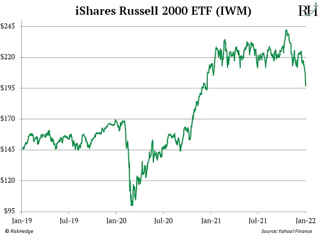
This is a big red flag.
Small-caps are now in a downtrend and look headed lower.
And that’s not the only corner of the market under stress.
- Mid-cap stocks are selling off too…
Mid-caps represent medium-sized companies. They’re usually less risky than small-cap stocks.
But mid-caps haven’t been immune to volatility. In fact, they’re also starting to roll over.
You’re looking at the performance of iShares Core S&P Mid-Cap ETF (IJH), which invests in mid-cap stocks. You can see that IJH just recently broke below support that has held for months.
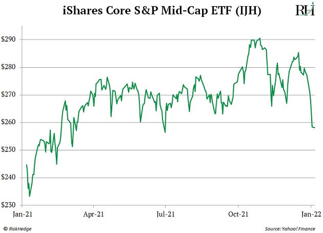
It’s also trading below its 200-day moving average. This means mid-cap stocks are no longer in an uptrend.
Neither of these things are good signs for the market. They tell us that risk is rapidly spreading. We’re even seeing it in the biggest, most important stocks.
- Mega-tech stocks are starting to break down too…
This chart shows the performance of The Direxion Nasdaq 100 Equal Weighted Index (QQQE). This fund invests in stocks that make up the Nasdaq, and it’s equally weighted, meaning it measures each specific stock proportionally—giving the same importance to each one, regardless of size.
It gives us a good sense of how tech stocks are doing. You can see QQQE’s weekly chart just started to roll over.
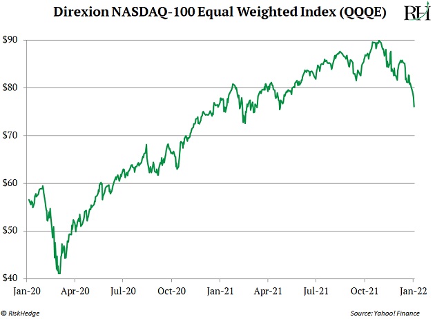
This is another bearish indicator. It tells me large-cap tech stocks will experience more pain for at least the next few weeks.
Unfortunately, I can’t tell you how much further large tech stocks may fall. This could simply be another correction, or it could be something worse.
We’ll only know once it’s in the rear-view mirror.
But it’s not all bad news.
- Certain pockets of the market are still showing strength…
The next chart shows the price of copper over the past two years. You can see that copper is still holding up well. In fact, the price of copper jumped more than 2% recently when most stocks got crushed.
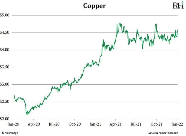
Now, it’s possible copper follows stocks lower, but it’s showing a lot of strength.
We’ve also seen a lot of strength in other commodities. So, there’s a chance copper heads higher out of this consolidation pattern.
This is a big deal, and not just for companies that mine copper.
- Copper is one of the world’s most important commodities…
You see, copper is a key input into many modern goods. It goes into everything from piping to electrical wire... to cars and smartphones and TVs.
Many seasoned investors look to copper as a bellwether—a leading indicator for the economy and stock market. If copper is rising, it means the economy is likely healthy... which is usually a good sign for the overall market.
Right now, copper isn’t flashing any major warning signs. Instead, it looks like it may be setting up a major leg higher.
- Another promising development is in emerging market stocks…
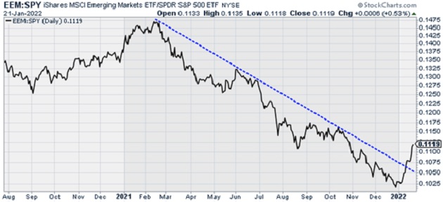
This chart shows the performance of the iShares MSCI Emerging Market ETF (EEM) versus the SPDR 500 ETF (SPY).
EEM invests in stocks from emerging markets like Brazil, Korea, and China. SPY invests in stocks that make up the S&P 500.
In other words, this chart compares the performance of emerging market stocks vs. US stocks. When this line is falling, it means US stocks are outperforming emerging market stocks. When it’s rising, it means emerging market stocks are outperforming.
Below, you can see emerging market stocks have been in a sharp downtrend versus US stocks since early 2021. But that’s reversing.
Source: StockCharts
This doesn’t mean US stocks are finished, but it looks like emerging market stocks will outperform US stocks for now.
- Having said all this, it’s probably still too soon to buy commodity or emerging market stocks…
Right now, major indexes like the S&P 500, Dow Jones Industrial Average, and Nasdaq are under serious pressure.
If we see a big flush in the indexes, it’s possible that everything sells off hard… even the strongest segments of the market.
So if you’re looking to put new capital to work, I’d wait until the dust settles.
Once that happens, focus your attention on the areas of the market displaying the most strength. Right now, that’s commodities, energy stocks, and emerging market stocks.
Keep in mind, I’m a trader. So I’m looking to sidestep any further weakness in the stock market. I’d rather wait to enter new trades when a new uptrend is established. This will help avoid “catching a falling knife.”
If you’re a long-term investor in great businesses, stick to your plan. This could be a great opportunity to buy top disruptive names at a massive discount. My colleagues Stephen and Chris will have more to say about that soon.
The Great Disruptors: 3 Breakthrough Stocks Set to Double Your Money"
Get our latest report where we reveal our three favorite stocks that will hand you 100% gains as they disrupt whole industries. Get your free copy here.


