The world’s most important charts are all saying the same thing…
Stocks could be headed much higher.
That’s not a scenario most traders are entertaining.
Many traders I speak with are scared. Some even believe we’re on the verge of WWIII.
I’m much more optimistic. And that’s because several of the most important charts I watch are pointing to higher stock prices.
Let’s start by looking at the SPDR S&P 500 ETF Trust (SPY), which tracks the S&P 500. You can see it appears to be forming a massive “cup and handle” pattern.
This is a bullish setup. Typically, cup-and-handle patterns resolve higher, igniting new uptrends:
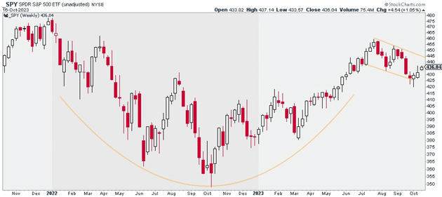 Source: StockCharts
That alone makes me bullish. But we’re also seeing this in the world’s most important index.
The Invesco QQQ Trust Series 1 (QQQ), which tracks the Nasdaq 100 Index, is setting up the same way:
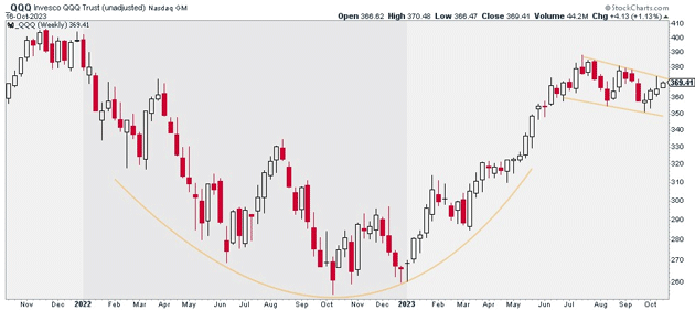 Source: StockCharts
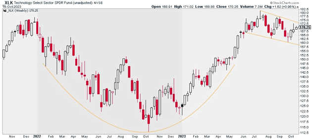
The Technology Select Sector SPDR Fund (XLK) is also working on its very own cup-and-handle pattern:
 Source: StockCharts
That’s a big deal. Technology is the most important sector. It accounts for 28% of the S&P 500 and 49% of the Nasdaq.
If it breaks out to the upside, it’ll be hard to be bearish on the indices. And there’s a good chance that happens…
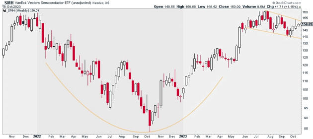
Apple (AAPL) and Microsoft (MSFT), which together make up 46% of XLK, are also building out cup-and-handle patterns. The same goes for the VanEck Semiconductor ETF (SMH):
 Source: StockCharts
Together, these charts paint a very bullish picture.
Of course, it’s not all rainbows and butterflies.
The stock market still has its fair share of issues…
Interest rates keep climbing. And the US dollar remains strong.
So, be selective if you’re buying stocks here. My favorite group is large- and mega-cap growth stocks.
Justin Spittler
Chief Trader, RiskHedge
